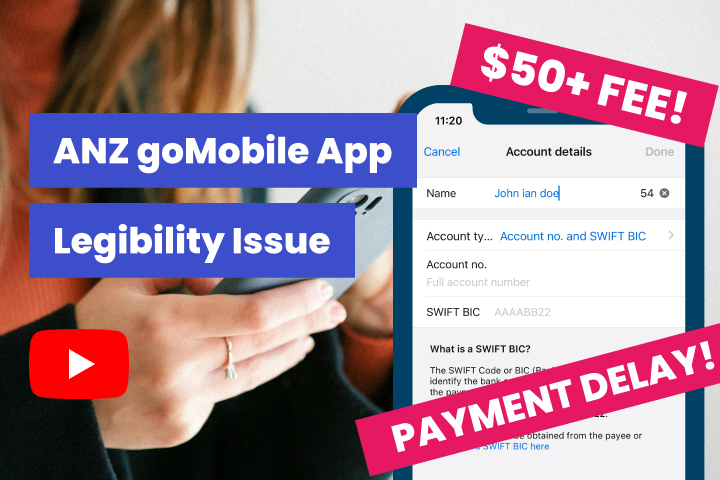
I use ANZ goMobile to manage my finances and make payments locally or overseas. At one point, I mistakenly typed the small letter “L” instead of the capital letter “I” ending up paying a fee to change the account name. The ANZ did not bother notifying me of such an issue until the person I needed to pay contacted me.
The frustration and stress were beyond my limit as I couldn’t believe a simple mistake could cause me a fee and waste time and effort to call back and forth with ANZ customer support.
To improve the user experience, we must be aware of similar letters when selecting a font family for the input fields. Below are some examples of similar and related letters that can confuse users.
- i vs l vs 1
- O vs 0
- rn vs m
- cl vs d
In this video, I will show you a couple of screenshots where the typo mistake happened and the UI design solution.
Transcription
I normally use ANZ Go money to manage my finance and make overseas payment, and I noticed is that there’s a eligibility issue with the alphabet letters. I ended up paying a $50 penalty fee from the bank, which is ridiculous. Right? It also caused a payment delay to the person that I’m transferring the money, and I wasted time and effort since I have to call the ANZ support for a couple of times just to fix it. So I’ll walk you through what I meant by that.
So let’s say you ended up in your ANZ Go Money mobile account and you go to the payments screen. And then let’s say you pick offers as payment and then this is where they prompt you to pay new account number. I tap the pay new account number and then I enter the name. So for example, the name of the person that I’m sending the money to is John Iando. So it’s an I.
But then when I type it, I did not notice that this I that’s supposed to be I, it’s a small letter l. As you noticed, the mobile keyboard, the I and l are quite close to each other. So I mistakenly typed l instead of I. So I ended up typing John Landau. So the solution is to find alphabets or font family that can distinguish between an I and l.
I hope that ANZ finds another font family so that it can provide a better user experience for their customers. Thank you, and I’ll see you next time.
Our website services
Need a website or help? Contact us