Dovetail is a great tool for research repositories, data analysis and user research. I have promoted their tool to the companies I have worked with and have used them for quite some time now.
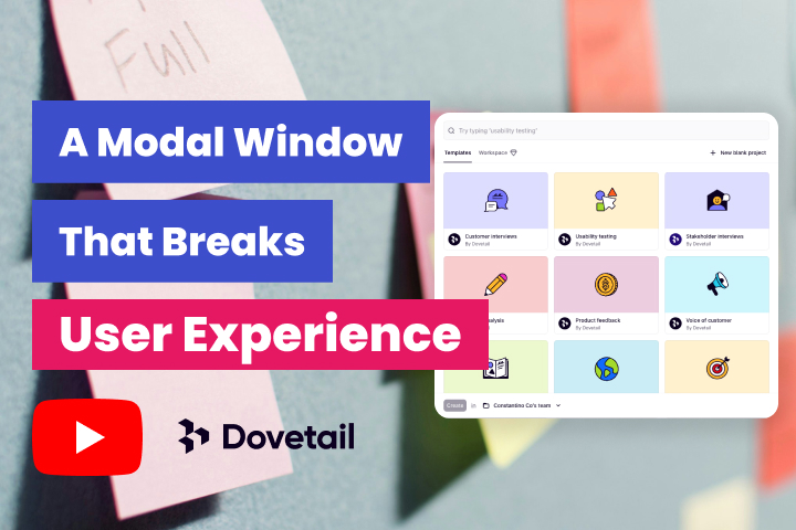
In this video, I will address several usability concerns within the modal window, including the template cards, the search input field, and the Create button. The principles of user experience design, specifically Hick’s Law and the Aesthetic Usability Effect, are applied to analyse and fix these issues.
Transcript
I use Dovetail to manage my user research and I noticed that each time I start a new project by clicking a new button here, it pops out a model window. First one is each card has a hover state of the title in the tooltip. And I think there is no added value by having a hover state there. It’s just a repetitive. They can just remove it.
Secondly, each card does not explain what the template has to offer. It doesn’t give you information what to expect, What’s the difference between each template and what features does each has? This falls under Hick’s law, not to simplify to the point of abstraction. My suggestion is to remove the dovetail logo and the label by dovetail and replace it with a description. This will help the users to understand more what each template can do.
The third one is the search input field here. You can search a template by typing the keyword. By then, there are only about 15 templates at this time. The search input can be more helpful if you can search by description, which I mentioned earlier on my suggestion. I can understand on the scalability where potentially they can increase the templates by 30 or 50 weekly.
When I started a project, I was waiting for a couple of seconds and I saw that it will load up new page. I didn’t realize that there is a create button here that you need to click in order to load that usability testing template. This falls under aesthetic usability effect where I got too distracted with the with the visual elements here. The idea of notice that there is a create button down here that you need to click. My suggestion is to increase the size of the create button and use an accent color.
And then, potentially, they can try to minimise or make it less prominent, the visual elements here for each card. That’s pretty much it. Let me know your thoughts by writing a comment, and I’ll see you next time. Bye.
Learn more about our website services
Need a website or help? Contact us