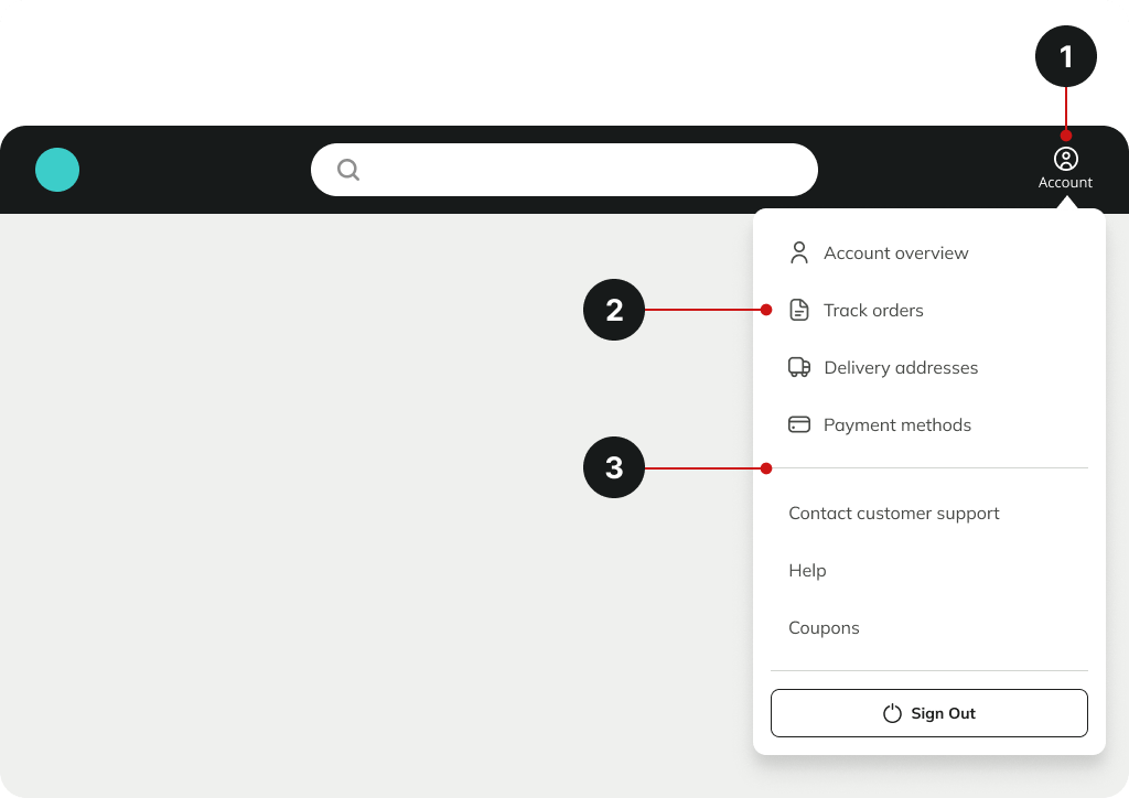
Accessing account information is crucial for users to track open orders and update personal details, such as passwords and delivery addresses. The Account dropdown menu enables users to access essential pages quickly.
Here are some website design best practices for the Account menu.
- Place the Account menu on the top right-hand side of the header, as this is the common place for the users to access it based on their prior eCommerce experience.
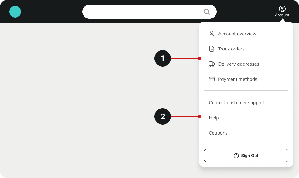
- Include commonly used icons on primary links to help users quickly recognise and digest important information.
- Differentiate between primary and secondary links in the dropdown menu to indicate their relative importance by using a divider or by using a heading.

1. Primary links refer to the frequently visited links by users to access and manage their Accounts.
- Account overview is link to the account dashboard
- Open Orders
- Order history
- Personal details
2. Secondary links contain promotions and support
- Contact customer support
- Help
- Coupons
The Sign-out button often differs from the rest to prevent accidental clicks due to its different UI treatment, aligns with user expectations, and provides a visual cue for the importance of the action.

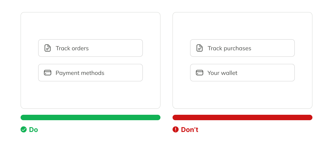
Use common eCommerce terms that users are familiar with to help them access the information faster
- Track orders instead of Track purchases
- Payment methods instead of Your wallet


