Overview
The design process is pretty straightforward in the early stage of TheMarket as a minimum viable product. As the product grows, we realise that we need to start documenting our UI patterns and components.
Problems
Over time, as we introduce more UI patterns and build new components, it is increasingly difficult to manage the designs and keep track.
Due to rapid changes and quicks decisions made by the top, the development team comes up with their designs without consulting the UX design team, creating inconsistent UI design patterns, conflicting UI components, and brand inconsistency.
Some mockup designs have lack specifications when handed over to the developers, so they build it based on their knowledge and understanding.
Lack of development resources to help me build the design system
The Head of design from the marketing design department has started building the style guide in Adobe XD. I used it few times, and I faced roadblocks because:
- It is not scalable.
- The designs need to be created on six-screen breakpoints, which is inefficient.
Goals
To establish a consistent design and well-defined specification encoded in HTML and CSS for the dev team and other teams to reference.
To be more efficient in the design process and during dev handover.
To present and roll out the design system to the organisation as the centre for visual language, foundational component, and pattern library.
Research and Discovery
It is my first time building a design system, so I started reading online articles from Brad Frost – Atomic design, UXdesign.cc, Medium, Adobe blog, Invision blog, Youtube videos and many more.
I also checked some pattern libraries and design systems from Atlassian, Mailchimp, Google Material.io, Polaris by Shopify and other UX / UI designer’s portfolios.
I picked some of my references from Google Material design, Atlassian and Mailchimp, then combined them, which makes up a part of the TheMarket design system.
Process
Step 1: Design audit
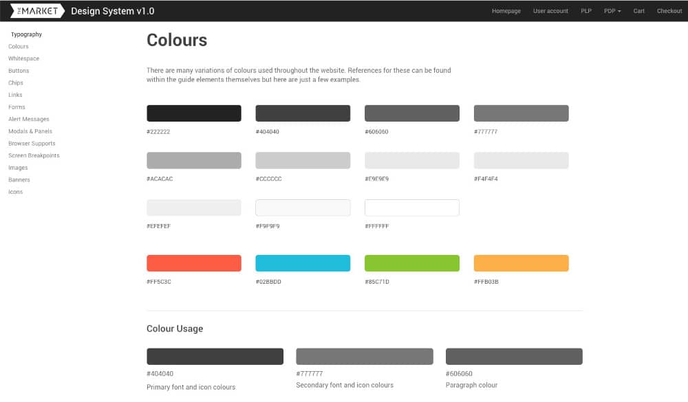
I listed down the elements that I need from the Adobe XD style guide like the typography, brand colours (primary and secondary) and icons. I then reviewed the eCommerce website, listing down the atoms (Definition from the Atomic design) and components that I need for version 1.
From time to time, I have to collaborate with our front-end developer to check if the components are reusable or unnecessary.
Step 2: Building the design system
I decided to use the Bootstrap CSS framework because our platform uses its 12-column grid and UI, also I am familiar with it.
I began setting up the page layout then start adding the basic atoms like headings, font sizes, font weights, colours, icons and images. I took screenshots on the eCommerce website for the images, added markings, and wrote the measurements.
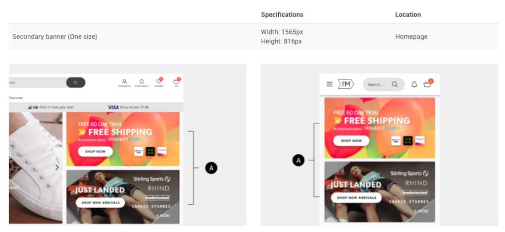
I then expanded my design system, covering the components like buttons, forms, links, chips and alert messages.
Step 3: Documentation
I wrote the basic guidelines, do’s and don’t, variations (e.g. buttons, forms and alert messages), browser supports and screen breakpoints.
Step 4: Feedback and early launch
I presented my early stage of the design system to the development team and marketing team to gather feedback. It was a good discussion where the teams suggested adding accessibility and pages with components.
On the other hand, the dev and marketing teams have started using it as their guide. Minor tweaks are being improved in the eCommerce website over time.
Step 5: Expanding the components and pages
I decided to expand the components by building the pages for the user account, product listing, product detail, cart and checkout. Then I thought of focusing on the mobile screens then add the desktop screens later stage.
Step 6: Challenges
After six months of the early launch, I noticed that the design system is hard to scale up due to my code structure.
I tried to diagnose and found the issues.
- I am using Bootstrap, and I overwrite the styling, which creates unexpected behaviour and additional styling.
- I copied the HTML structure and CSS styling of the components in the website, which cause some conflict with my code structure.
- It was a mistake for separating the mobile and desktop builds. They should come hand in hand.
- Multiple front-end developers touched and wrote the same components, which becomes hard to understand.
The Head of design has left the company. It is a big blow as he is the voice of TheMarket brand; we are constantly collaborating and documenting the design system.
Step 7: Revision
After realising my challenges in scaling up the design system, I decided to rework and start again. The positive outcome is that I learned from it.
Before I started building version 2, I asked for help and guidance from our front-end developer on:
- How to build the code structure neatly
- How to scale the components properly
- If the front-end developer can constantly review my work during downtime
- When to reuse the code and not
- Support on building some functionalities that I need
I learned that:
- It is better not to use Bootstrap and build the structure from the ground up.
- I should use my HTML structure and CSS styling to avoid conflict. The front-end developers can read and understand my code quickly.
- When building the component, I should consider the smartphone, tablet and desktop screen together.
- I should find time to collaborate and ask questions from the front-end developers even this project is not in our priority list.
Step 8: Journey to the design system 2.0
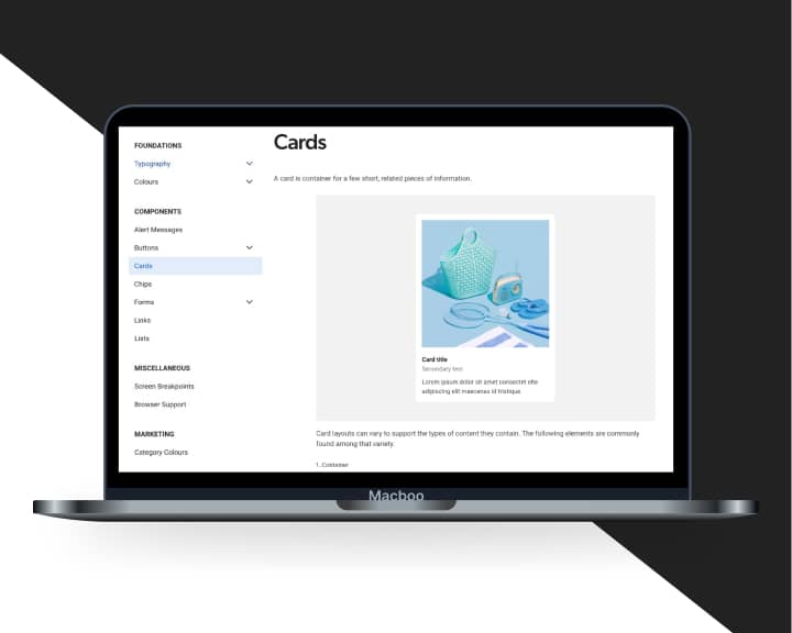
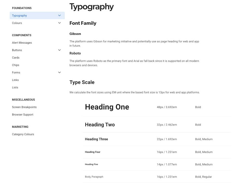
I started properly rebuilding the structure, making the code cleaner, adding basic accessibility guidelines, and using some existing contents from the design system version 1.
On the visual side, the font sizes are bigger for readability, cleaner and minimalist style. The components look way better now after redesigning it and passes the accessibility online checker.
Step 9: The launch
I launched the design system version two to organisation as a source of truth.
Step 10: Iteration
The design system has been through multiple iterations based on the feedback from the cross-functional teams, UI patterns and component updates from the development team, and my online research.
Outcome
The development team is more confident with using my design system. I can see the consistency of the UI patterns and components applied in the eCommerce website and the mobile apps.
Conclusion
Due to resource limitations and low priority project from the business, the design system currently exists only as a visual and technical reference. I hope they will dedicate a resource team to scale up the design system to build accessible and usable products.
